Here is a number worth sitting with for a moment: 80% of trade show leads are never followed up on.
Companies spend an average of $24,000 per Trade Show Stand Design — on space rental, stand build, logistics, and staff — and then leave the majority of that investment sitting in a spreadsheet that nobody opens. But before you point the finger at your sales team’s follow-up habits, consider that many of those leads were never properly captured in the first place. And the reason they weren’t captured often starts not with process, but with design.
The U.S. B2B trade show market hit $16.4 billion in 2025, finally surpassing pre-pandemic levels. Attendance is up. Decision-maker density is high — 81% of attendees have buying authority, and 67% are net-new prospects your sales team has never spoken to. The room is full of exactly the right people. Which makes the stands that fail to capture them all the more costly.
After designing and building exhibition stands across Europe, the Middle East, and North America — for shows from Hannover Messe to GITEX to CES — we’ve seen the same design mistakes repeated at every price point and booth size. Here are the five that consistently cost exhibitors the most leads.
1. Your Stand Is Speaking Too Many Messages at Once
Walk a trade show floor and count how many stands try to say five things simultaneously. Product line A. Service tier B. Award from 2022. Partnership announcement. Global presence claim. All of it competing for the same three seconds of an attendee’s attention.
Research on attendee behavior is unambiguous: visitors decide whether a stand is relevant to them within the first few seconds of seeing it. If your messaging doesn’t resolve to a single clear answer to “what does this company do for me?” in that window, the opportunity walks past.
The instinct to pack a Trade show stand with every possible message comes from a real place. Your marketing team has spent months on campaigns. Your product team is proud of the full portfolio. Your leadership wants visibility on recent milestones. The stand feels like the one moment to communicate everything.
But the psychology of exhibition environments works against that instinct. Attendees are moving through a hall with hundreds of competing stimuli. Cognitive load is high. Decision fatigue sets in by mid-morning. The stands that attract people — and keep them — are the ones that make it effortless to understand the single most important thing you do.
The fix: Anchor your Trade show stand Design around one headline message that speaks directly to the problem your best customers have. Everything else — product detail, supporting claims, social proof — belongs in the conversation your staff has once someone steps in, not on the fascia board competing with your logo.
2. Your Layout Creates Barriers Instead of Invitations
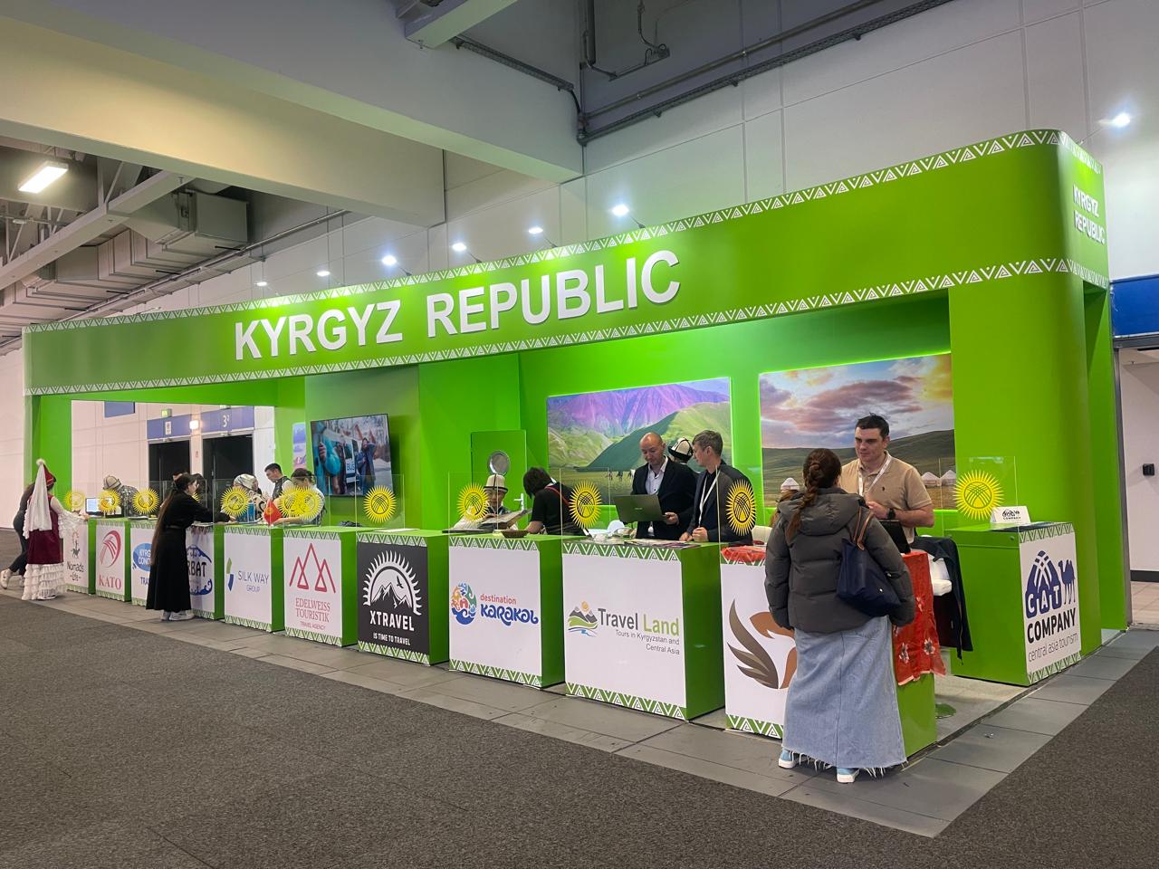
There is a structural mistake that appears in roughly half the stands we encounter at mid-sized B2B shows: a counter placed across the front of the booth, parallel to the aisle, with staff standing or sitting behind it.
It feels natural. It gives your team somewhere to put literature. It creates a reception point. What it actually does is tell every passing attendee: this space is closed to you. Stop here, don’t come in.
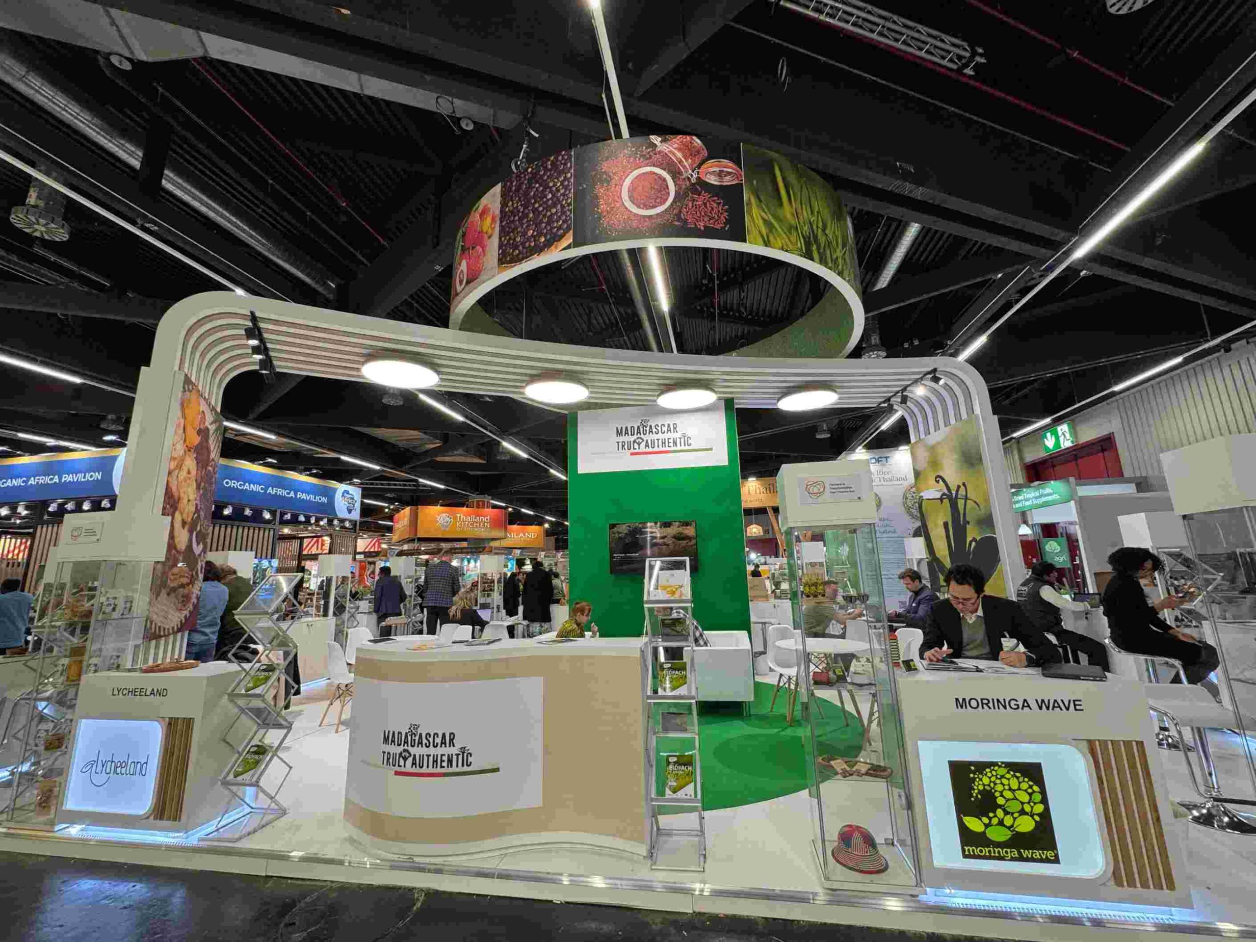
The counter barrier is the single most documented layout error in trade show stand design, and it persists because it solves an internal comfort problem (staff feel anchored, materials have a home) while creating an external engagement problem (attendees feel like they need permission to enter). The research is consistent: open-plan booth layouts, where attendees can walk into a defined space rather than stopping at a threshold, generate measurably higher dwell time and conversation rates.
Dwell time matters more than most exhibitors realize. One study found that each additional minute an attendee spends in a booth increases lead quality by approximately 23%. A layout that keeps people at arm’s length is not just an aesthetic choice — it is a revenue decision.
The same principle applies to furniture placement, product display positioning, and staff behavior. Any element that creates a physical or psychological boundary between your team and an attendee is working against your lead generation goals.
The fix: Design your stand so the natural path of an attendee walking the aisle leads them into your space, not up to a barrier at its edge. Move counters and tables to the sides or rear. Create an open zone at the front where a brief, easy conversation can start without either party feeling committed to a 20-minute meeting.
3. Your Stand Looks Good in Renders but Performs Poorly in the Room
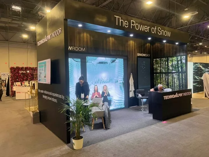
There is a meaningful difference between a stand that photographs well and a stand that generates leads. Design built for renders tends to optimize for visual drama — tall structures, bold graphics, dramatic lighting. Design built for conversion optimizes for something harder to render: the quality of interaction that happens inside the space.
Stands that perform well have a few things in common that rarely show up in the design brief. They have clear sightlines — visitors can see what’s happening inside the stand from 15 to 20 feet away, which creates the social proof that draws additional traffic. They have a live demonstration or activity running continuously, because visible engagement is its own form of marketing on a show floor. And they have considered the practical reality of conversations: where two people stand comfortably, how a tablet or screen integrates naturally into a discussion, where notes or literature can be accessed without breaking the flow.
Nearly half of all exhibitors — 48% — believe that eye-catching displays are the most effective way to attract booth traffic. They are right that visual presence drives initial stopping power. But stopping power and conversion are not the same metric. A stand that draws people in and then fails to give them a reason to stay, or a clear understanding of what to do next, has wasted the most expensive part of the journey.
The fix: Before signing off on a design, pressure-test it against the conversation you want to have. Where does the opening interaction happen? What does the attendee see, touch, or experience in the first 60 seconds? Is there a natural path from initial engagement to a deeper conversation or demonstration? If the design doesn’t have answers to those questions built in, the render is misleading you.

4. Your Messaging Talks About You, Not to Them
This is the most common content error on trade show stands, and it is invisible to most exhibitors because it feels like the right thing to do. You have invested in the stand. This is your moment. Your logo is prominent. Your product images are large. Your company history is on the side panel.
Here is the problem: 92% of trade show attendees are at the show primarily to find new products and solutions that solve problems they currently have. They are scanning the room not for impressive companies but for relevant ones. The distinction matters more than most stand briefs acknowledge.
A stand that leads with “Who We Are” messaging — company name, heritage, global presence, awards — places the burden of relevance on the attendee. They have to do the work of figuring out whether you matter to them. A stand that leads with “What Problem We Solve” messaging does that work for them.
Consider the difference between:
“Global Exhibition Stand Design & Build” (company positioning)
“Your Stand Should Win You Business. Here’s How We Make That Happen.” (attendee-relevant)
The second version opens a conversation. The first one describes a category.
Forrester research shows that 71% of B2B buyers expect personalized interactions at exhibits. That expectation starts before anyone opens their mouth — it starts with whether the messaging on your stand signals that you understand the person walking toward you.
The fix: Rewrite your primary stand headline by starting with the attendee’s problem or goal, not your company’s capability. Lead with outcome language. “More leads from every show,” “Exhibition stands that pay for themselves,” “Stand design that stops the right people” — these are headlines that create a reason to stop. Your company name earns its place once you’ve established relevance.
5. Your Stand Has No System for Capturing What Conversations Create
You can do everything right — compelling messaging, open layout, engaged staff, strong demonstrations — and still leave a show with a fraction of the value you generated, because the lead capture process fails at the moment it matters most.
This is not primarily a technology problem, though technology helps. Only 6% of exhibitors report being confident in their ability to convert trade show leads. The gap between that figure and the opportunity — 81% of attendees with buying authority, 72% more likely to buy from exhibitors they meet face-to-face — is largely a process gap, and much of that gap is shaped by the stand design itself.
Stands that are not designed with lead capture in mind create operational friction that compounds across two or three days of a show. Staff have nowhere to naturally record context after a conversation. Badge scanning happens as an afterthought at the end of an interaction rather than a natural part of it. Literature is handed out without any qualifying conversation taking place first. By the end of day two, you have a list of names and no memory of what made each conversation worth following up on.
CEIR research shows that exhibitors using structured qualification methods convert 31 to 54% of conversations into qualified leads — a significant gap from the average. The difference is process, and process is enabled or disabled by the physical environment.
The fix: Treat lead capture as a design requirement, not an afterthought. Build a clear capture station or moment into the stand flow. Decide before the show what a qualified lead looks like — budget, timeline, authority, need — and brief your team on the two or three questions that establish those criteria quickly. Train staff to capture a sentence of context immediately after each interaction, not at end of day when the details have blurred.
The 48-hour follow-up window is real. Research consistently shows that 50% of trade show buyers choose the vendor that responds first with relevant information. A stand that enables fast, contextual follow-up is a stand that converts.
The Uncomfortable Truth About Trade Show ROI
Trade shows deliver exceptional returns when executed well. Converting a trade show Stand lead costs 38% less than converting a lead through traditional field sales. The average cost per lead at a well-run B2B show benchmarks at $112 to $186 — lower than most digital channels for high-value sales cycles. Fortune 500 companies that execute properly report 5:1 ROI from their exhibition programs.
The companies that don’t see those returns aren’t attending worse shows or talking to less qualified audiences. They’re making the same five design and execution errors, show after show, because those errors feel like reasonable decisions when you’re standing in a briefing room looking at renders three months before the event.
The stand your company takes to its next show is either built to generate leads or it isn’t. That question gets answered in the design phase — not on the floor.